FX EMPIRE
FXEmpire is a global financial news portal offering real-time market news, analysis, and tools for investors and traders.
It covers a wide range of topics, including Forex, CFDs, cryptocurrencies, and personal finance.

My Role at FXEmpire
As the Lead UX/UI Designer at FXEmpire, I led a complete UI redesign and an overhaul of the user experience for both the website and mobile app.
My role involved rethinking the navigation structure and improving user journeys, ensuring the design not only looked modern but also aligned with business goals.
.jpeg)
Before - light mode
.jpeg)
Before - dark mode

After - light mode

After - dark mode
After redesigning the currencies and other instruments pages on the FX Empire website, we achieved a significant 17% increase in average time spent by users.
Following the redesign of the currencies and other instruments pages on the FX Empire website, we observed a 17% increase in average time spent on these pages and a noticeable reduction in bounce rate over a three-month period.
By using Google Analytics and Hotjar, we analyzed user interactions on high-traffic instrument pages and identified key areas for improvement, such as enhancing content hierarchy and highlighting information that users engaged with for longer periods.
These enhancements made the information more accessible and engaging, encouraging users to delve deeper into the website.
Company needs
Emapthy
Structure
Collaboration
Challenges in the Journey
UI Redesign and Design System Development
One of my main responsibilities was leading a full-scale UI redesign for the website and app. The goal was to modernize the platform’s visual style, making it more appealing and easier to use. I also introduced a new design system to maintain consistency across all touchpoints, streamlining future design work and improving overall efficiency.
Revamping the Navigation Structure
A key challenge was completely restructuring the website’s navigation. The previous navigation was complex, and users often struggled to find relevant content. I focused on simplifying the navigation flow to create a smoother, more intuitive experience, guiding users to where they needed to be.
Creating New User Experiences
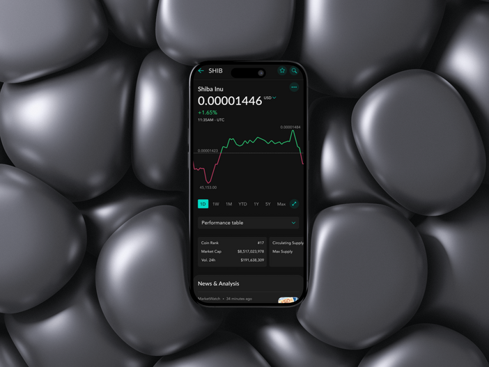
I developed a fresh UX approach for both the website and app, enhancing the flow of information to ensure users could easily access the content and tools they needed. This involved introducing a customizable watchlist feature and restructuring the financial elements page to improve clarity and usability, ultimately meeting the diverse needs of users.
Facilitating Collaboration Across Teams
Throughout the redesign process, I prioritized close collaboration with product managers, developers, and content creators. By fostering open communication and incorporating feedback from various stakeholders, I ensured that the final designs aligned with business objectives and user needs.

Before

After


